Sunday, March 7, 2010

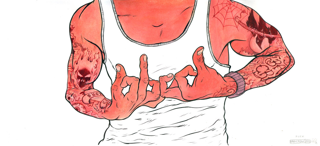
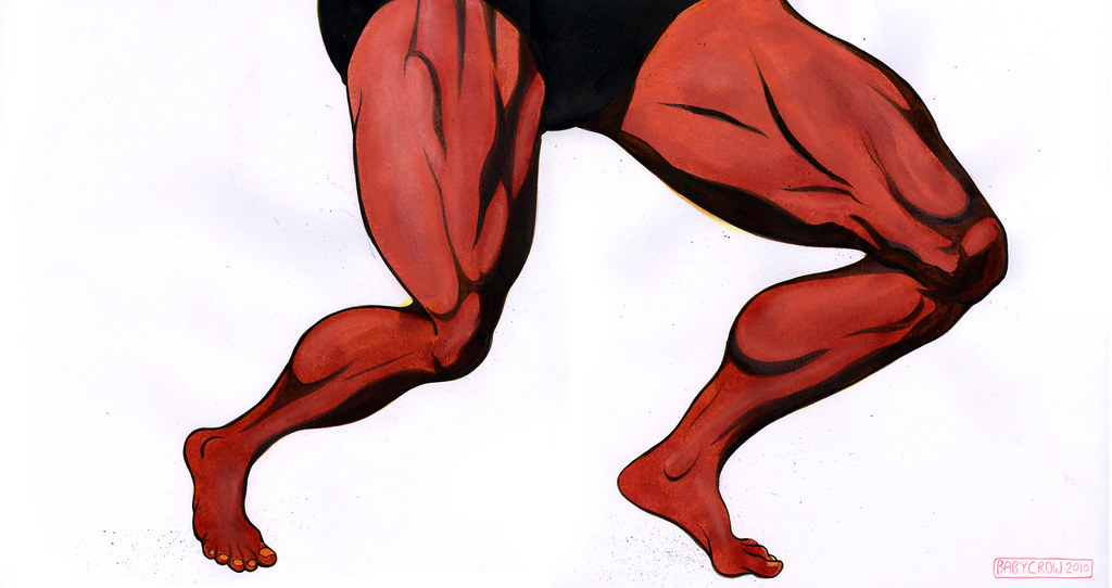
MR UNIVERSE


Another piece for the Go Red charity auction. This time I did some legs, I was quite torn with which subject matter to choose but ended up doing some giant Mr. Universe pins. It was drawn in red pencil and then watercoloured, the shaded areas were supposed to be a slightly darker colour to the main skin red but I over cooked it a bit. The result is quite interesting and it has a bit of a Mignola Hellboy look to it! I work some pastel in for the highlights.

Saturday, February 27, 2010

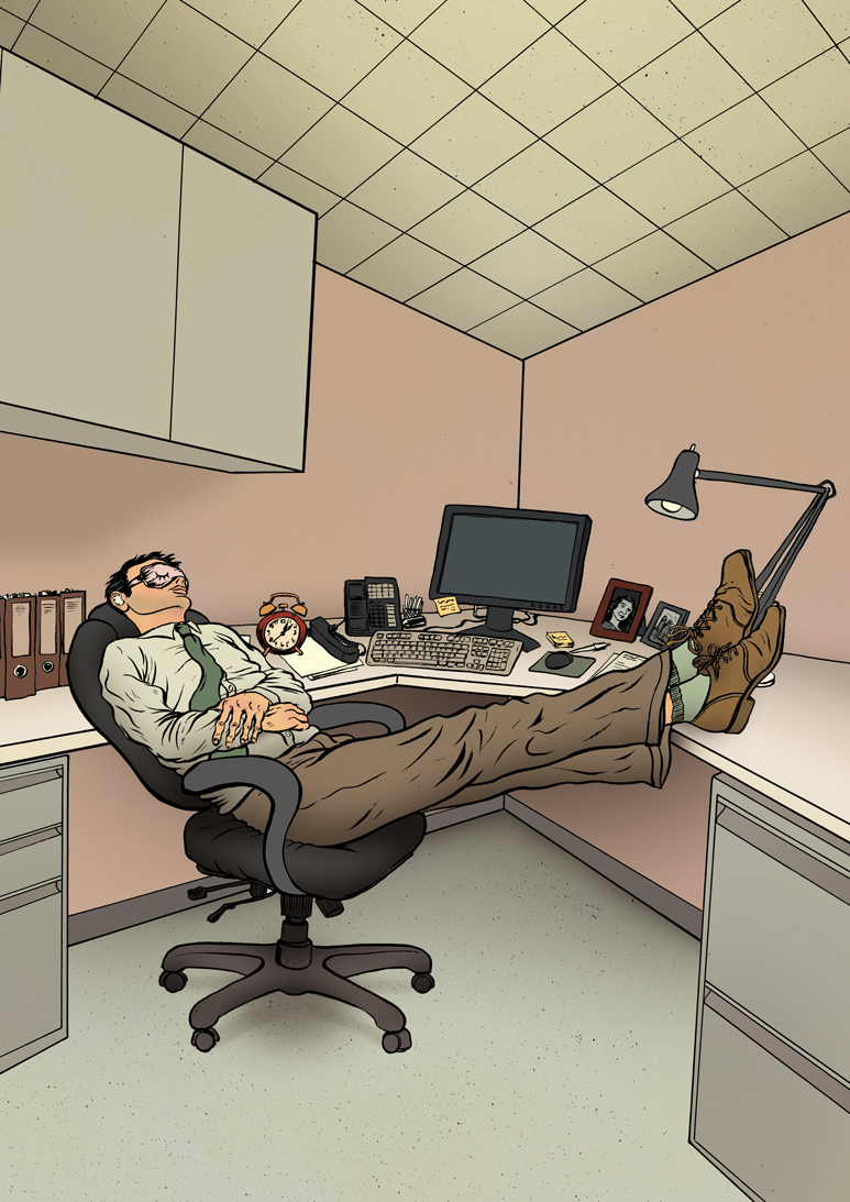
20 MINUTE RECHARGE


I have an illustration in this months copy of Men's Fitness.


The article is about coping some zzzs at work. This brief was very quick turnaround but I think it ticks all the boxes. I went for a Matrix style green tinge to the colouring, stopping short of adding a "hello neo.. the Matrix has you." on the screen.

Friday, February 26, 2010

READ ALL ABOUT IT: CROSSEYED & PAINLESS


Here is the flyer for the Crosseyed & Painless show. Looks like its going to a good night! I like what they've done with the logo colourway here, nice two tone gold oww!

checkit

Wednesday, February 24, 2010

CROSSEYED & PAINLESS


This is a logo design for a club night that's coming up soon. I will post more info as soon as I get it.

GO RED BLOOD


This is for a charity auction called 'Go Red'. It will be held at the coningsby gallery on wednesday 31st of March. The idea is to do a remote collaborative 'consequences' drawing, like the ones where you draw a head, fold it down and pass it along to someone to draw the body etc. I got body as part of a group project with the new illustration collective PUCK. The rules were that it had to be predominantly in red. I went with the blood gang sign plus prison tattoos. Didn't want you to think I was going soft doing this charity stuff!

http://www.goinggoinggone-red.org/?p=224

Tuesday, January 26, 2010

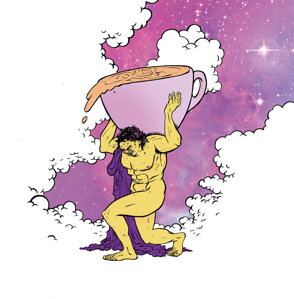
ATLAS


Another UKBC concept. Vetoed on account of being to anatomical/homo erotic. Fair enough this time!

LADY OF THE LATTE


This was a certificate design option for the UK barista championships. I had a death in the family around the closing date for this project and so they may have had to go with another design. This piece is loosely based around the art work for the film 'Excalibur' and I've gone for that 80s airbrush effect. For those of you unfamiliar with the coffee industry, they run these competitions where baristas can attempt to out do each other in the noble art of coffee making. The device in the Lady of the milky Lake's hand is a portafilter which is used in making espresso. A well established industry professional pointed out that the lake of milk splashing about and dripping down the supernatural water dweller's wrist could be considered as looking 'spermy'. I choose to ignore his comments.