Monday, October 20, 2008

Sunday, October 19, 2008

SICK


just been going through some portfolio bits. I drew this originally for a don't panic design brief but prefer it without all the type required for the poster. sick slick

Saturday, October 18, 2008

Thursday, September 18, 2008

POSTERWALL


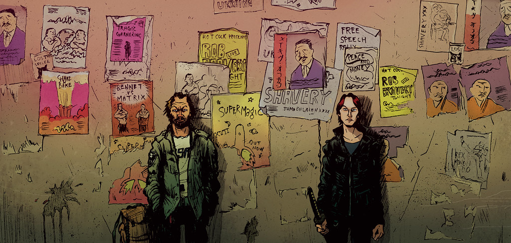
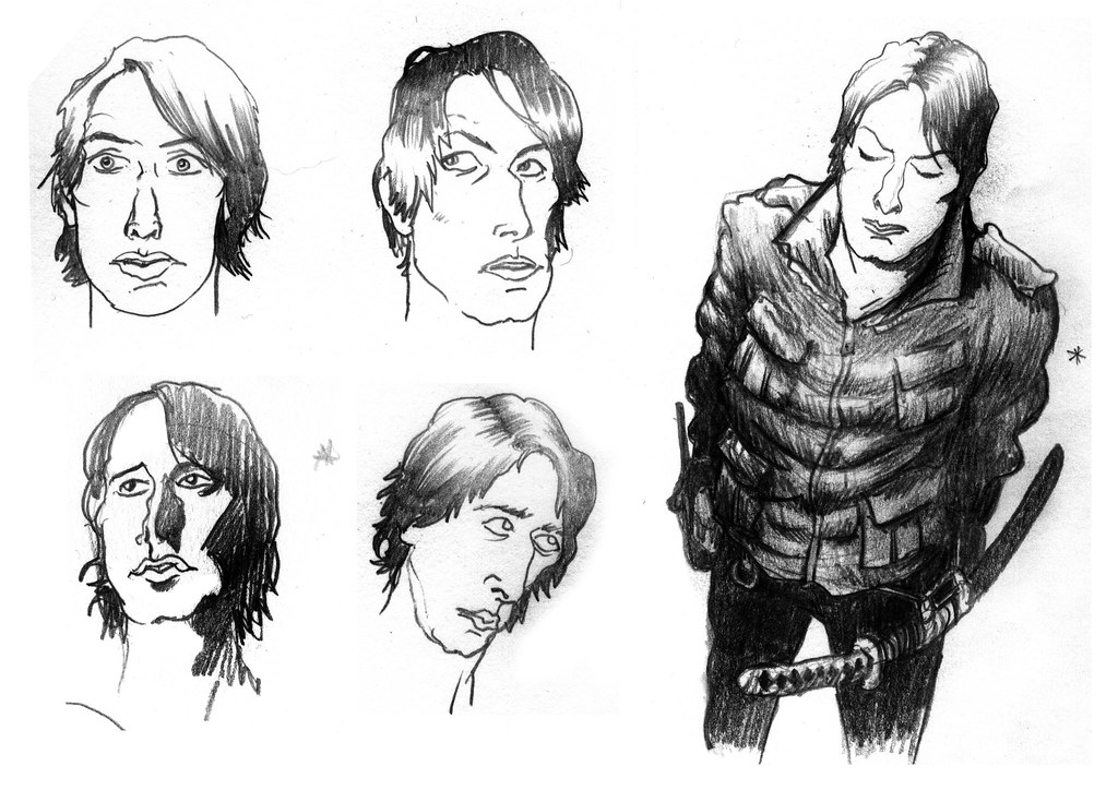
I've been working on some character sketches and playing with some different rendering techniques on photoshop. The character on the left is DeathWatch Bastard and the guy on the right is Johnny Omens. The posters on the wall are partly random and partly advertise some friends and bands that i know, rob bravery is a top drawer musician and supermagic being one that i was in. Peter Attridge is a prolific producer of posters (particularly for the ukraine girls) and I have honoured him in this scene, check out his beef. I've been attempting to create a slightly more organic feel to the colours, I want the comic to have a lived in feel.

Thursday, September 11, 2008

GOD


yo, this is a design for the don't panic pack competition. There aren't that many in the running this month so i stand a reasonable chance of getting somewhere. your votes would fill me with such joy! end date is the 15/09/08. big love

vote for me please!

I will also be posting a high res version on flickr so you can see the glorious screen tone in all its crisp edged wonder. I've just moved house and BT are screwing around with our broadband. Hence the limited number of posts this month. Bastard BT!

Monday, August 25, 2008

JOHNNY OMENS


These are some early character designs for a new comic project that I'm working on in my spare time. The character is called Johnny Omens, I can't take imaginative credit for this name however. It was my sister's imagination that conjured the name when she heard it banded around in a meeting, having made a note of it she asked a colleague about him, only to realise it was John Yeomens! I declared that Johnny Omens was a badass name and could I have it? So thank you Sara! Mr Omen's features are based on those of Stephen Malkmus..

Monday, July 7, 2008

A BOY NAMED SUE COMPLETED


Yeah! This little project has achieved some state of completion (on a cottage industry level anyway). The cover was a new challenge. This is the first fully painted illustration that I've done in a long while. I wanted to do something a bit different to the inside and you often see comic covers painted or at least very highly rendered. Its pretty crude but I like it, I think it does a good job of setting up the inside. I read the 'comics patriarch' Infantino's words on the subject of covers where he talks about 'irritating the eye' and using negative space to draw the reader in. I've found this with my own work where some of the throw away crude drawings that I have produced are the persistently popular ones and the examples of finer draughtsmanship go under the radar. Sometimes the little oddities in an illustration are the things that really give the character.