Thursday, October 18, 2007
ROUGH SMOOTH
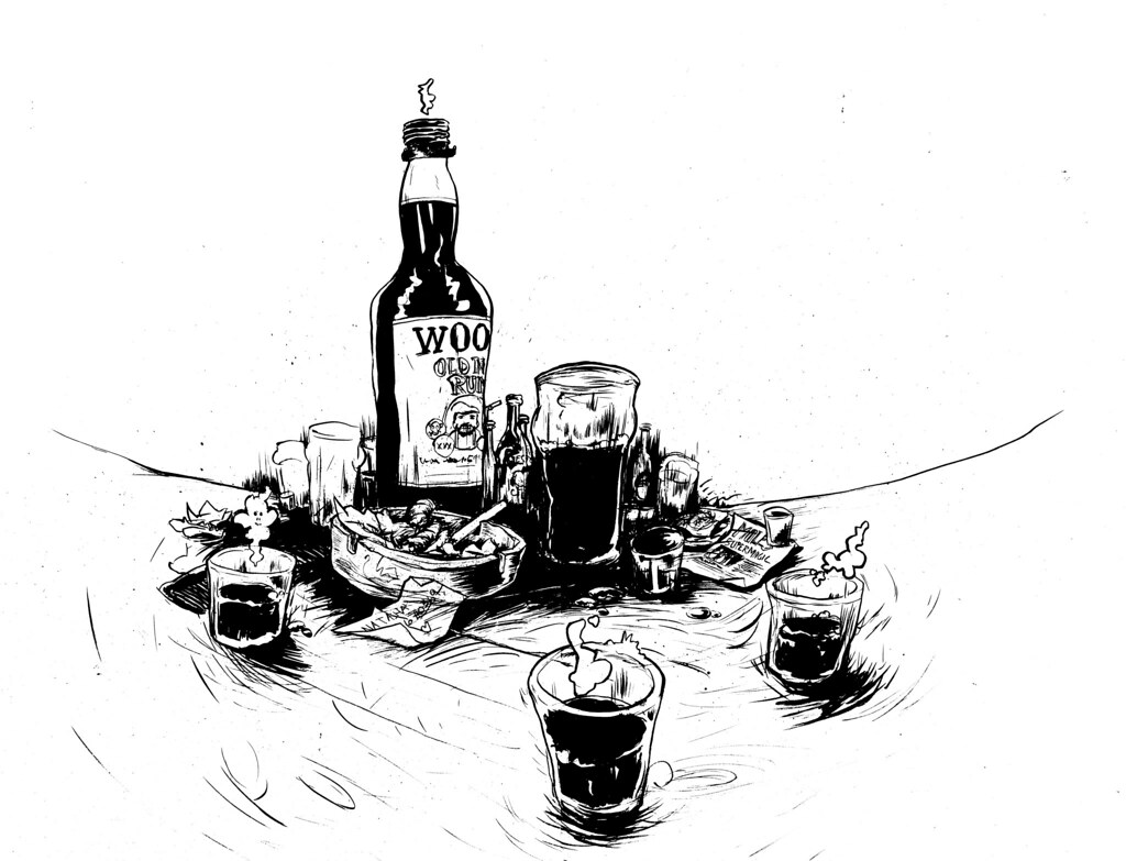
In preparation for the launch of supermagic's new album, I've been working on artwork for the cd covers etc. The plan is for this one to possibly go on the back cover, the negative space in the top right is a space that I left for track listings and other info. The scene depicted here is an average boston/supermagic night out, the drink of choice being the infamous Wood's rum which is stuff that I could just as easily use to clean my brushes! Wood's rum is featured in a number of the tracks from supermagic VIII.
Wednesday, October 17, 2007
SHADY
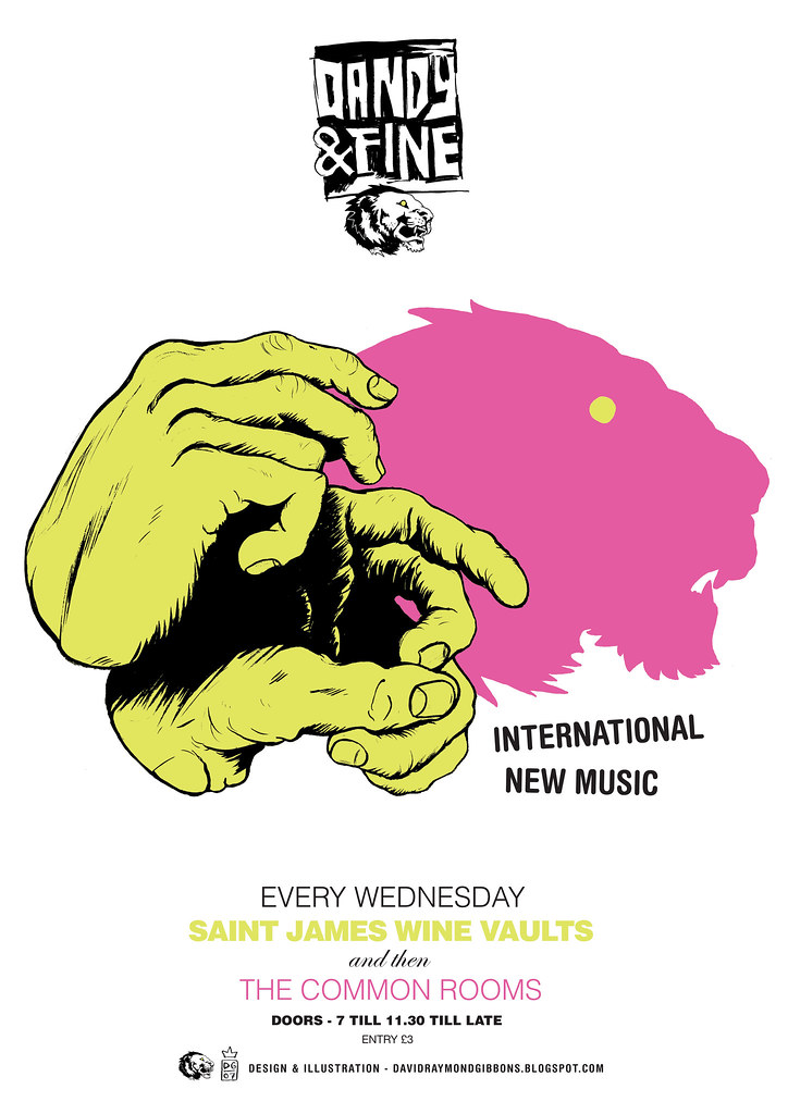
The newest dandy and fine poster incorporates shadow puppetry and computer aided typography. Most of my closest friends at university were designers and typographers who would gaze over my shoulder at the vague attempts i made at shuffling ugly clumps of type around and with a wry grin say things like "what are you trying to align that to Dave?" or "nice kerning Dave" or "do you want me to do it mate?". I'm not even joking when i say that i sat in rooms with these people while they literally talked about type for several hours. At the time I was uninterested, I had a go but was pretty crap at it and have since always used some sort of hand rendered type to get through situations that required any copy. I have recently been working on my type skills for the projects that I have on and its at these times that i remember all these things that used to bore me to death. The shades of my typographic colleagues haunt me with little "i wouldn't put that there"s!
Subscribe to:
Posts (Atom)