Monday, December 3, 2007

RETURN OF THE KING


designs for a Yule greetings card. the image represents the Sun King returning as the days begin to grow longer and the Sun's power grows. there is also a circular theme which represents the wheel of time and the cycles of the year.

Thursday, November 8, 2007

BURST ITS BANKS


These images for Chris Turpin are destined to become part of the soggy collage that adorns the beer soaked surfaces of venues around bath. Anyone who has enjoyed my company for a beer or two will confirm that I'm guilty of the highly irritating habit of tearing, folding or projecting these flyers around the table and if you're lucky i'll post instructions of how to make a little box out of one (this is a party piece of mine). Perhaps now that I have some first hand experience at producing a few I'll pay them a little more respect. People tell me its a sign of sexual frustration as well. Is that a good thing to broadcast, I can't decide.

Thursday, October 18, 2007

ROUGH SMOOTH


In preparation for the launch of supermagic's new album, I've been working on artwork for the cd covers etc. The plan is for this one to possibly go on the back cover, the negative space in the top right is a space that I left for track listings and other info. The scene depicted here is an average boston/supermagic night out, the drink of choice being the infamous Wood's rum which is stuff that I could just as easily use to clean my brushes! Wood's rum is featured in a number of the tracks from supermagic VIII.

Wednesday, October 17, 2007

SHADY


The newest dandy and fine poster incorporates shadow puppetry and computer aided typography. Most of my closest friends at university were designers and typographers who would gaze over my shoulder at the vague attempts i made at shuffling ugly clumps of type around and with a wry grin say things like "what are you trying to align that to Dave?" or "nice kerning Dave" or "do you want me to do it mate?". I'm not even joking when i say that i sat in rooms with these people while they literally talked about type for several hours. At the time I was uninterested, I had a go but was pretty crap at it and have since always used some sort of hand rendered type to get through situations that required any copy. I have recently been working on my type skills for the projects that I have on and its at these times that i remember all these things that used to bore me to death. The shades of my typographic colleagues haunt me with little "i wouldn't put that there"s!

Sunday, September 30, 2007

CHRIS TURPIN


this is concept work for Chris Turpin, I saw him play at the Porter (a pub in bath) and felt inspired! I heartily recommend that you have a look http://www.myspace.com/littlebigvoiceturpin I am aware that there aren't many deserts in the UK but Chris has a voice that sounds like he has seen his share of them despite his youth. The puff of steam in the distance can be whatever you want it to be but the intention was to indicate a steam train, the heading of which is the opposite to Mr. Turpin's purposeful stroll, taking the hard road!

Thursday, September 27, 2007

JELLY FINE


I have a weakness for anything that glows in the dark. I can't help myself. If I see people going around selling those glow sticks, I have to buy them even though I'm well aware of looking like a fool waving them around.

Sunday, September 23, 2007

BTP - EXETER


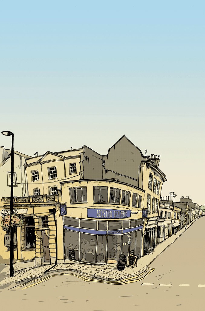
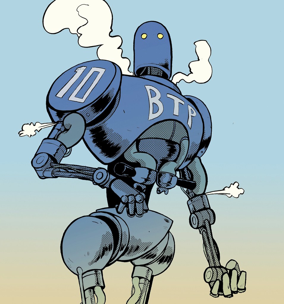
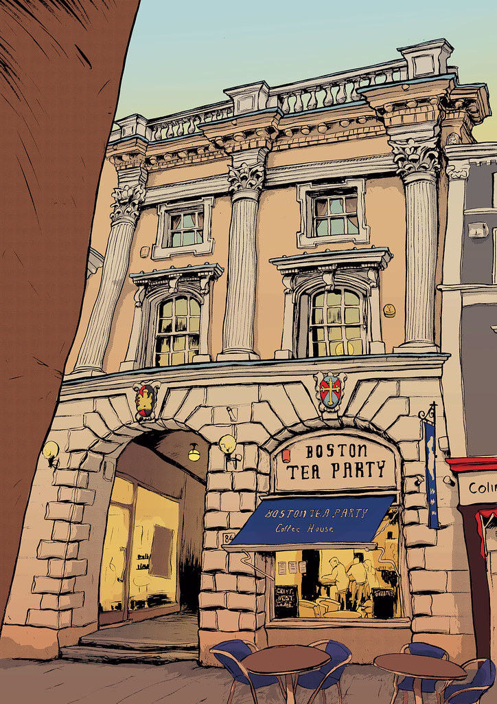
I went to the Exeter cafe the other day to do coffee training with the new staff there. If i'm honest, I rather enjoy the glory of rolling into a place where everybody knows your name and greet you with "are you the king of coffee?" (I am aware that i run the risk of sounding arrogant here but I do make a splendid latte with a beautiful rosette pattern!)The BTP images are all up around the cafe and have been recieving a lot of interest or so i'm told. Being recognised for these drawings, (as much as i take pride in making coffee), is so rewarding that it makes it all worth while. Its a strange feeling and although i will always ultimately be drawing to suit my own whim as an artist, its undoubtedly gratifying to receive compliments for my efforts.

I have spent some time going around the Children's Literature Festival in Bath today and seeing these great winding queues of people prepared to line up and wait for hours just to get a little squiggle and a brief shmoosey conversation with authors and illustrators, its quite inspiring. I imagine that the pride these people must feel for the recognition that they're receiving is great, despite having to tolerate the nutbars and overenthusiasts!

Wednesday, September 12, 2007

DANDY LION


These are rough poster designs for a weekly event in bath called Dandy & Fine. Its at two venues, first at a pub then onto a bar, 'dandy' then onto 'fine'. I think this one looks a bit like a giant Pez dispenser!

Friday, September 7, 2007

A FISTFUL OF COFFEE


Here is the fully coloured Clifton image. Many people say its their favourite. I think it looks like the town of San Miguel from a Fistful of Dollars, the Rojos on one side, the Baxters on the other, me in the middle and a Boston on the corner. If you don't know what i'm on about you should see the film, you should then see Akira Kurosawa's 'Yojimbo' which is almost scene for scene the same film but in feudal Japan. Sergio Leone was a big fan it seems. Both are legendary films.

Thursday, September 6, 2007

Tuesday, September 4, 2007

DAYGLO


I have always had a thing for colouring flesh in bright colours, like demons or imps. I love red or green skinned creatures but they creep me out. The childhood memory that this could possibly stem from is that of Mr Tumnus from the old school animated film of the lion, witch and wardrobe story. I'm sure i'm not alone in finding Mr Tumnus terror inducing and innately creepy. The first stranger you encounter in a foreign land, sporting forest green hair and dayglo pink skin and he attempts ensnare you with his flute. No thanks

Sunday, August 26, 2007

MBZ!


When two powerful baristas come together, they form Mega Barista Zord. Here is the boston tea party mk10 version, a veteran of the fateful '3K saturday' and when running full burn can produce eleven large latte to take away in five minutes. Mat North commissioned the MBZ project, a man of great wisdom and tenacity.

Wednesday, August 22, 2007

BTP - CLIFTON


For the first time with these BTP images, I drew this scene on location rather than from photographs. Although working from photos can yield nice results with captured individuals or unique distorted perspectives (particularly when photographed in narrow streets by an amateur with a cameraphone) for me, being there in the flesh was a liberating experience. If I couldn't figure out some of the details I would just roll in there and have a better look, none of this mega pixel shizzle. The only problem to come from standing there in the street, squinting at an illuminated sheet of bright white bristol board reflecting the sun at your chin, you look like an idiot!

Sunday, August 12, 2007

BEOWULF & THE GRENDEL


This was a birthday present for a friend, he asked for Beowulf fighting the Grendel so thats what he got! In the tale, Beowulf chooses to fight this foe without weapons or armor, thus proving his strength and prowess in battle. In the Grendel's haste to escape the duel that he is on the losing side of, he tears his own arm off! Who do you think is making the bigger statement here?

Monday, July 23, 2007

THE SAILOR


My flat mate and good friend Peter Attridge and I came up with an idea to promote our illustrative careers with a fake band. We proposed to send cds, flyers, posters and all other promo stuff out to prospective commissioners as a vehicle for our art work. A mutual, musically talented friend of ours, rob bravery then offered his services to produce a few tracks for us with me on vox and pete on drums and rob on everything else, so that we had some music to include with the art. A few jars of ale and bob is your uncle! We're now on ep VII and have yet to send any art out. As the band becomes ever more popular i thought that i should perhaps endeavor to actually produce some work for it. So this is the artwork for supermagic's new single entitled 'the sailor'.

Monday, July 16, 2007

DEAD PAN LIFE DRAWING


This man is reading the paper at the 'same same but different' cafe in bath. You always have a good subject in this state as we have a stationary target whilst remaining undetected in the act of drawing them (people get twitchy if they suspect).

Tuesday, July 10, 2007